Role:
Graphic Designer
Timeline:
2018
LEB2 stands for Learning Environment version B2 and is an education platform for online learning and teaching that is created under the Outcome-Based Education concept which tremendously emphasizes learners' outcomes and makes sure the learners are proficient.
About this campaign
This campaign introduces six new features in the LEB2 system, designed to elevate teaching support at KMUTT. LEB2 brings together essential tools for educators by allowing them to design courses, manage assessments, and create activities and assignments—all on one platform. By integrating these resources, instructors can streamline their workflow and enhance the learning experience without the hassle of juggling multiple platforms.
What I've done
Concept Development & Presentation
- I worked closely with the project owner to collect crucial requirements, making sure our campaign effectively captured and conveyed key messages to our intended audience.
On-Site Location Scouting
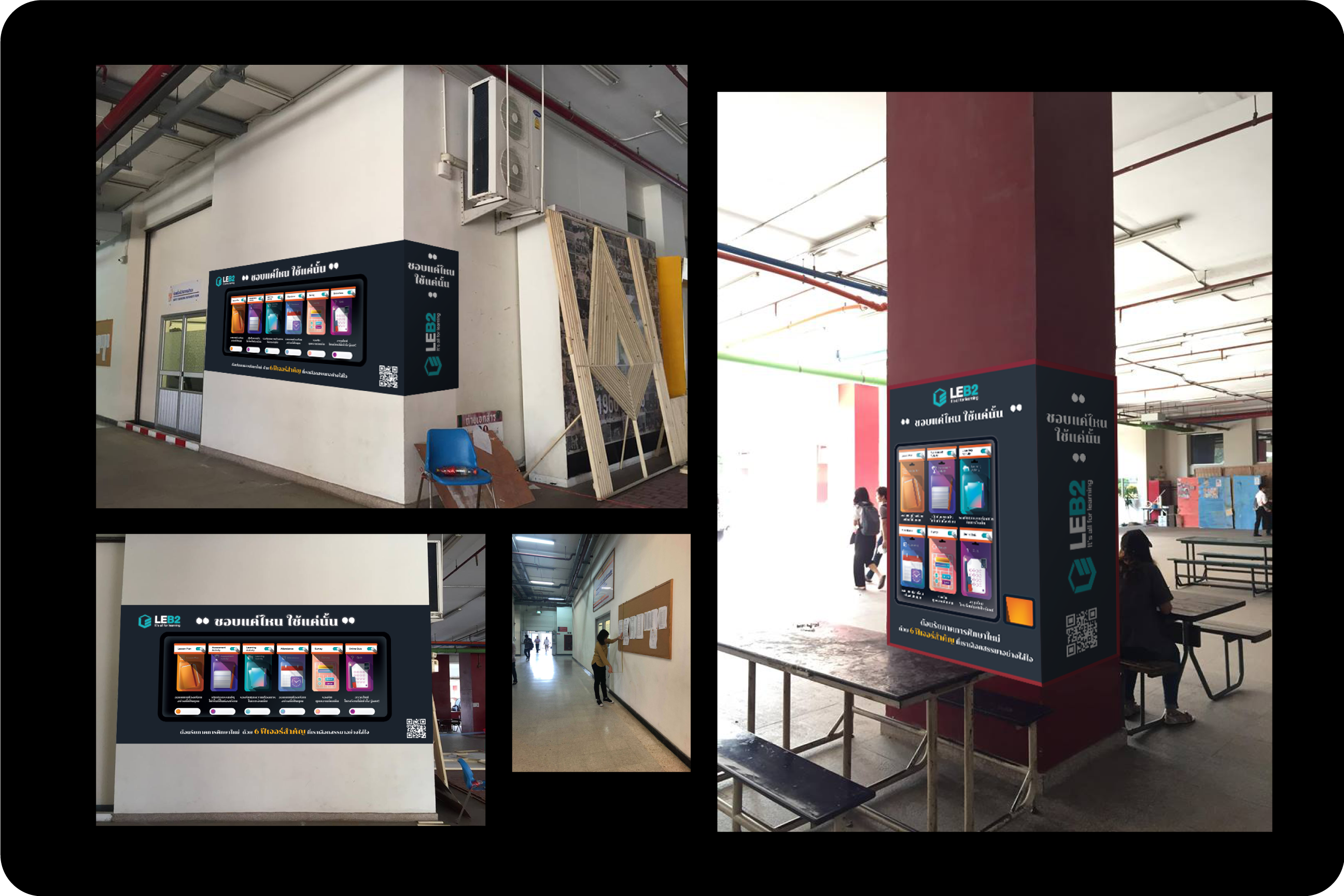
- As part of this on-site campaign, we conducted comprehensive site visits throughout the university to pinpoint the best locations for artwork installation. This involved assessing how our audience would engage with each piece, observing foot traffic, and pinpointing high-visibility areas versus quieter spots.
Artwork Design for Campaign
- Create tailored artwork for multiple locations, from walls to pillars and elevator doors, designed to catch attention and enhance awareness of the new LEB2 features among faculty and students.
Challenge
The main challenge in this project was transitioning from creating digital graphics for social media to designing printed artwork for outdoor installations. Unlike digital media, printed materials come with unique risks, such as potential color inaccuracies and size discrepancies. Compared to digital designs, which allow for quick adjustments, any errors in printed artwork are costly and challenging to correct. This project required a meticulous approach to ensure accuracy and quality in every aspect, from color matching to scaling, making it a valuable learning experience in handling print media.
Main Concept & Message
"As You Like it"
We created the "As You Like It" concept to address a common challenge in platforms—an overload of features bundled into one place, often resulting in a cluttered experience. Our idea encourages educators to focus on only the features they truly need, allowing for a more personalized, streamlined teaching style tailored to each individual.
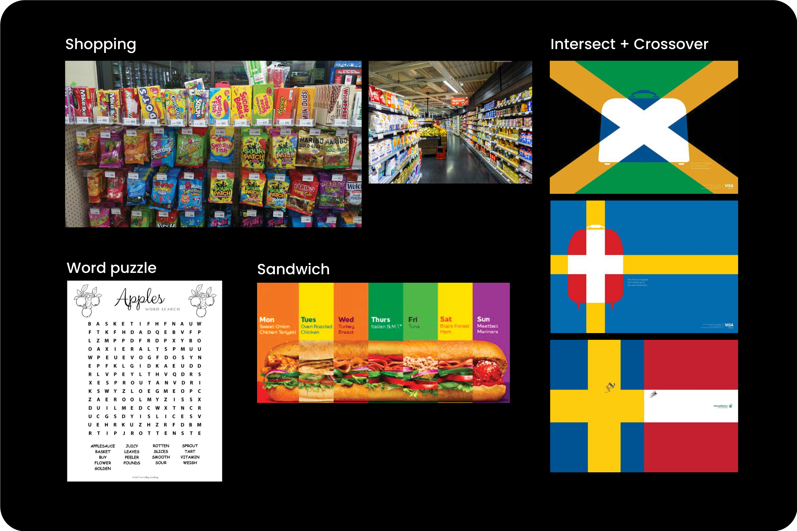
With this concept, we've developed a "shopping" metaphor where users can pick and choose features to create a customized experience. It’s all about focusing on what matters to you, selecting only the tools that support your unique teaching approach.
Mood & Tone
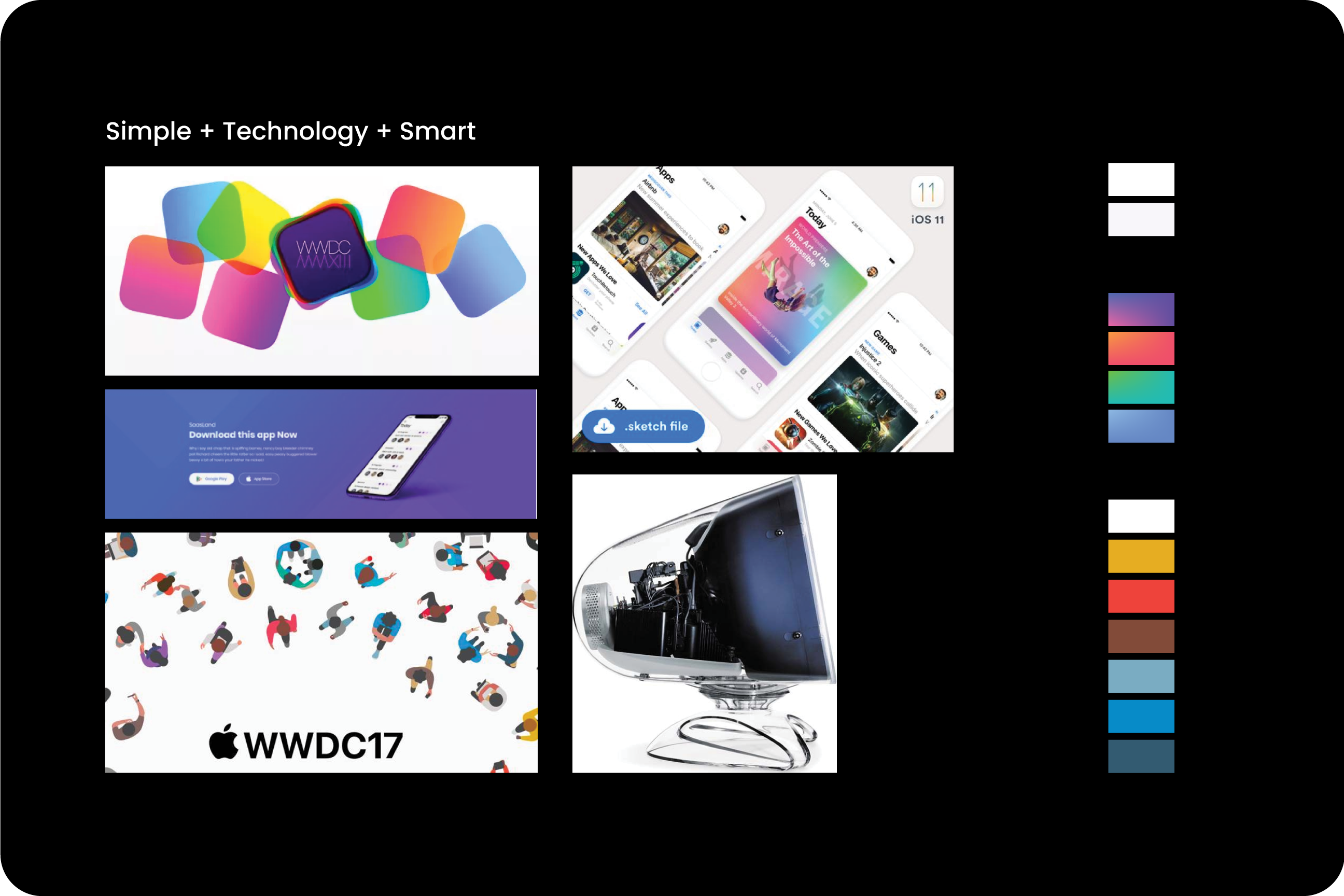
This artwork stands out with bold, vibrant colors to capture attention in an outdoor setting. We use a modern gradient effect to add a sleek, contemporary feel that enhances visual impact and ensures the piece feels fresh and cutting-edge. This combination of high-energy colors and smooth gradients creates a dynamic look, making the artwork both eye-catching and stylish in any setting.
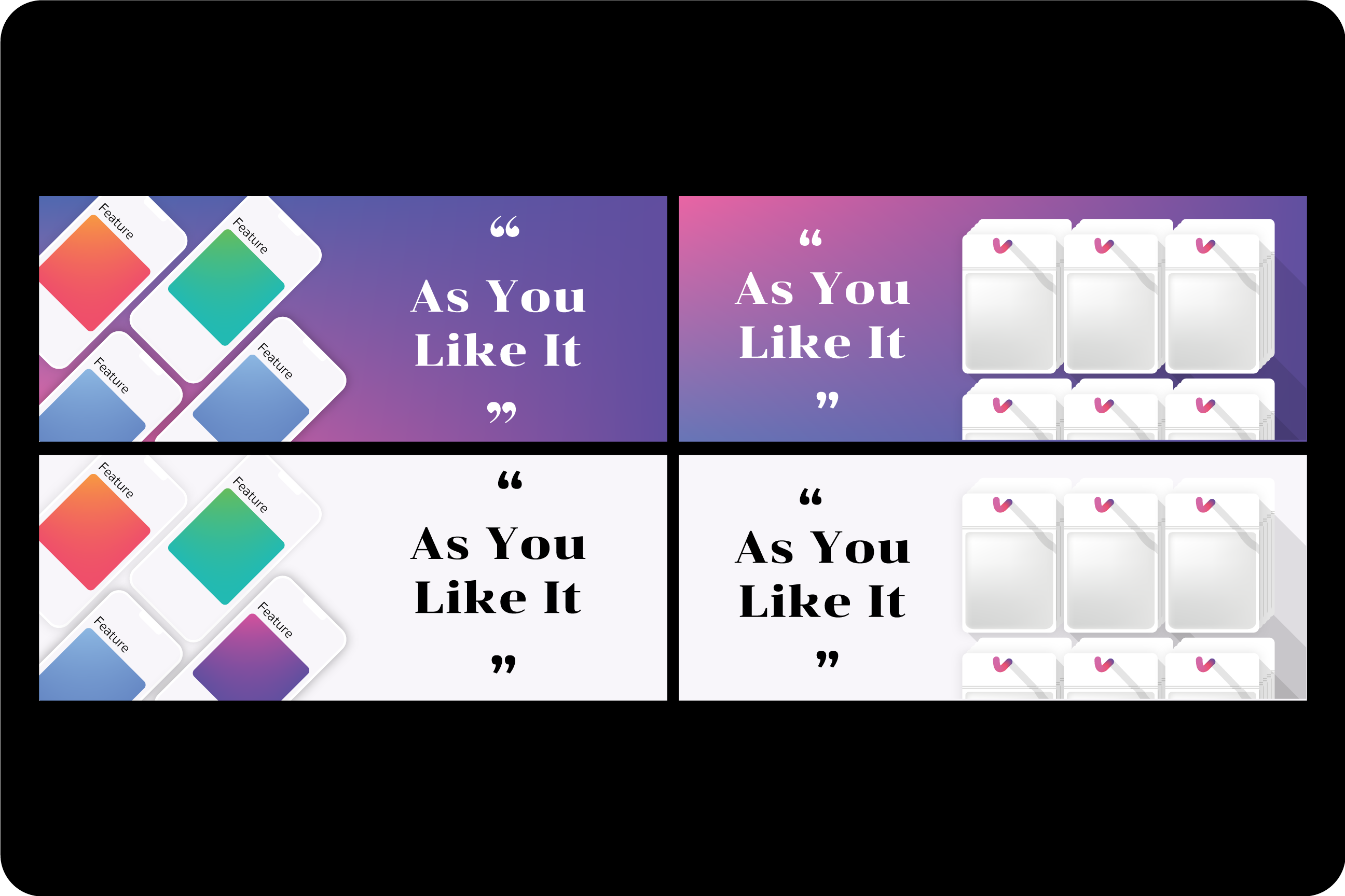
Brainstorm idea for visualization
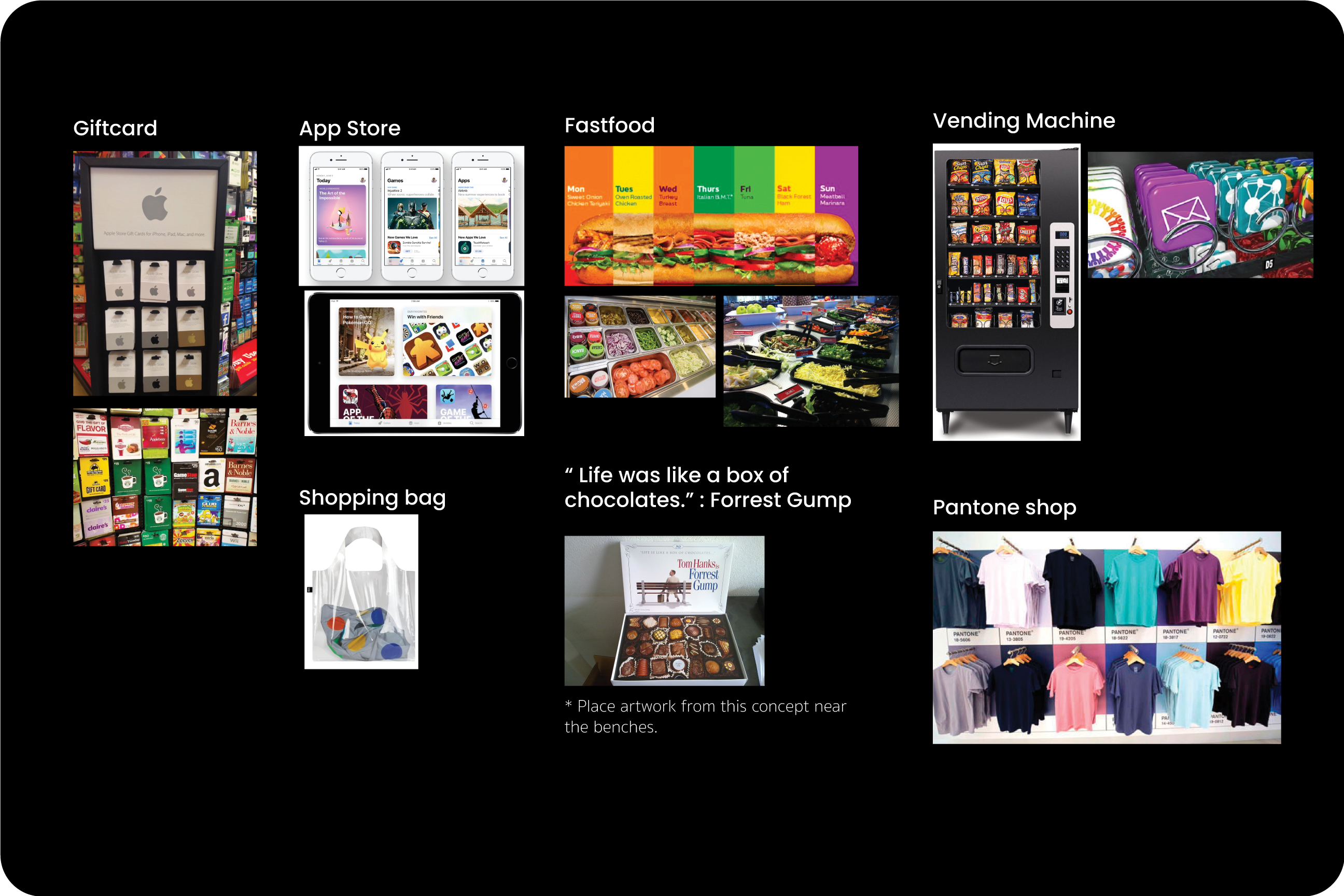
The "pick and choose" concept, inspired by the idea of selecting only what you need from a product shelf, received the highest votes and became the foundation for further development. We explored various visualizations to determine which design best communicated this concept, ensuring it aligned perfectly with the message we wanted to convey. This creative exploration allowed us to refine our approach and deliver a visual that truly resonates with the audience.
Develop the artwork
Once the artwork development began, the idea evolved into two key visual elements: the 'Gift Card' and the 'Vending Machine.' These concepts were carefully chosen to communicate the core message to our audience—the freedom to select only the features that are truly needed. The 'Gift Card' symbolizes personalization and choice, while the 'Vending Machine' reflects the simple and intuitive process of picking what suits you best. We designed these prototypes to create a clear, engaging visual experience that empowers users to make selections based on their own preferences.
On-Site Location Scouting & Prototyping
While developing the artwork, we also conducted a thorough site survey to identify the most suitable locations for installation. After selecting the ideal spots, we proceeded with mock-ups, incorporating the artwork into real-life photographs of the actual locations. This hands-on approach allowed us to visualize how the designs would look in context, ensuring that they stood out and captured attention in their intended environment.
Final Result
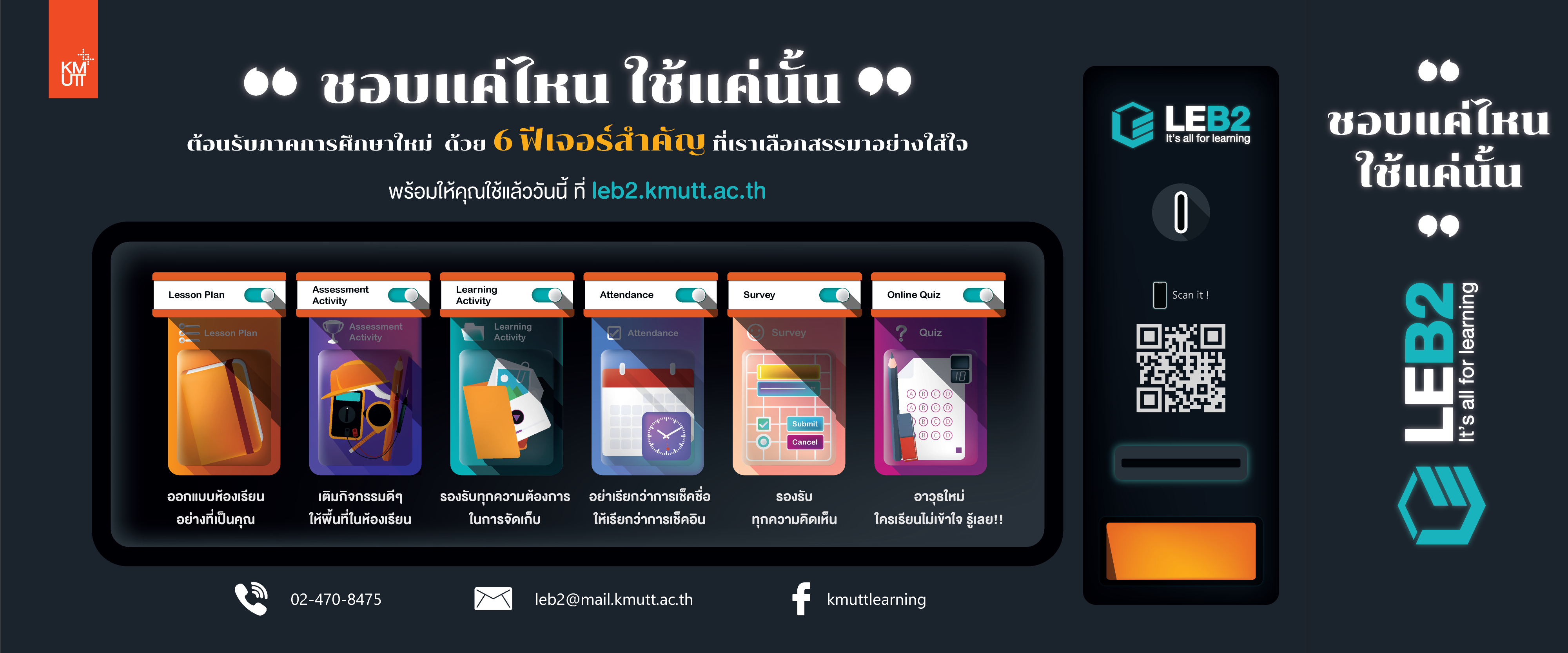
Artwork displayed across an expansive wall
Artwork designed for use in a standee, allowing for easy mobility during promotional events and campaigns.
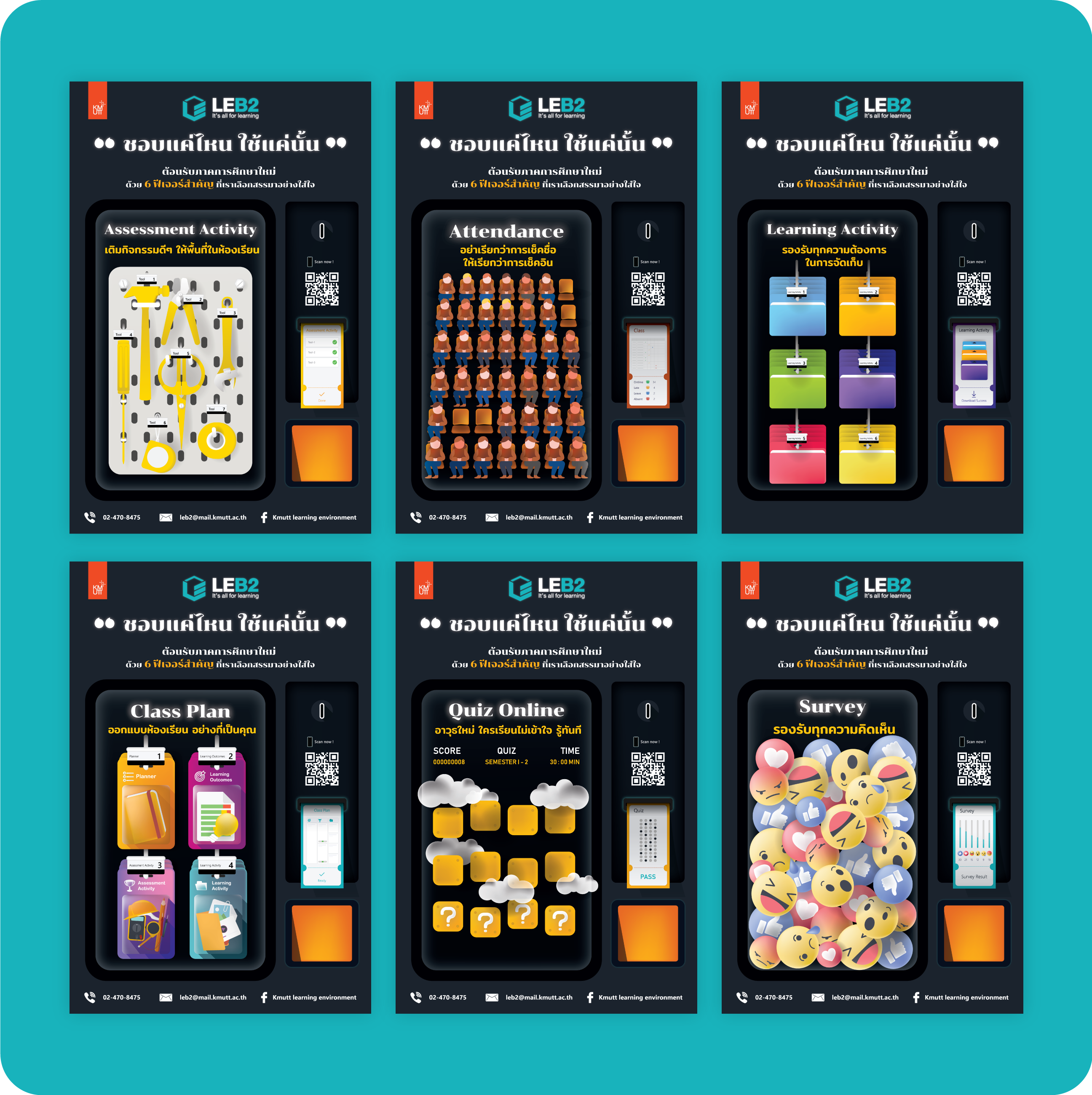
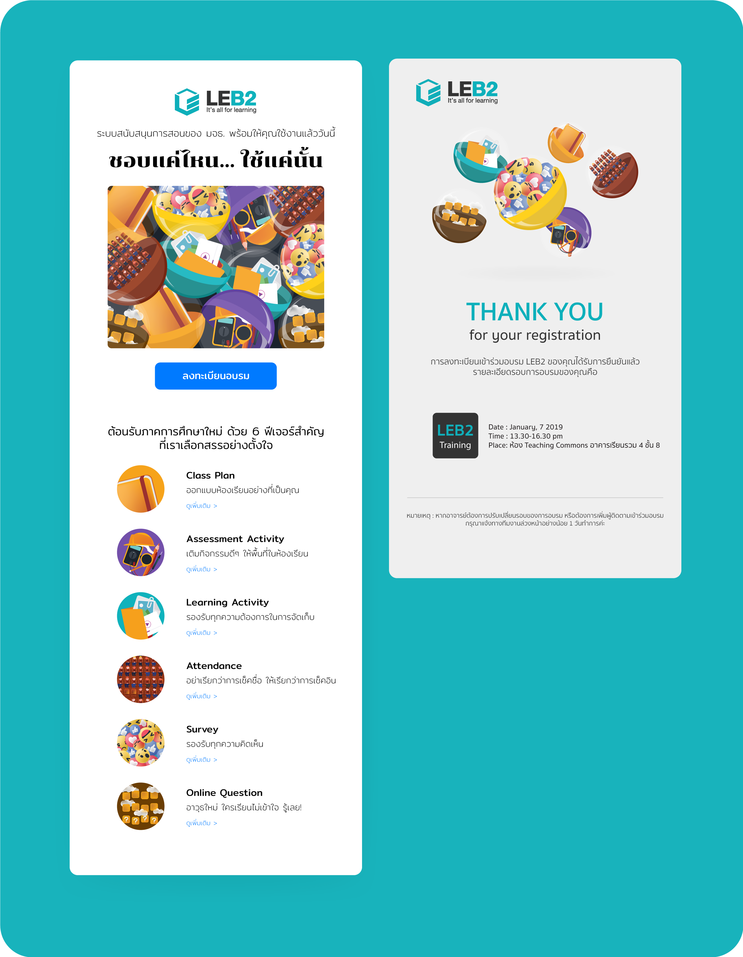
We created artwork for email distribution to audiences or target groups to promote this campaign, as well as artwork to announce training sessions on the new features of LEB2.
